Toddle — Free Education & Kids Website Template
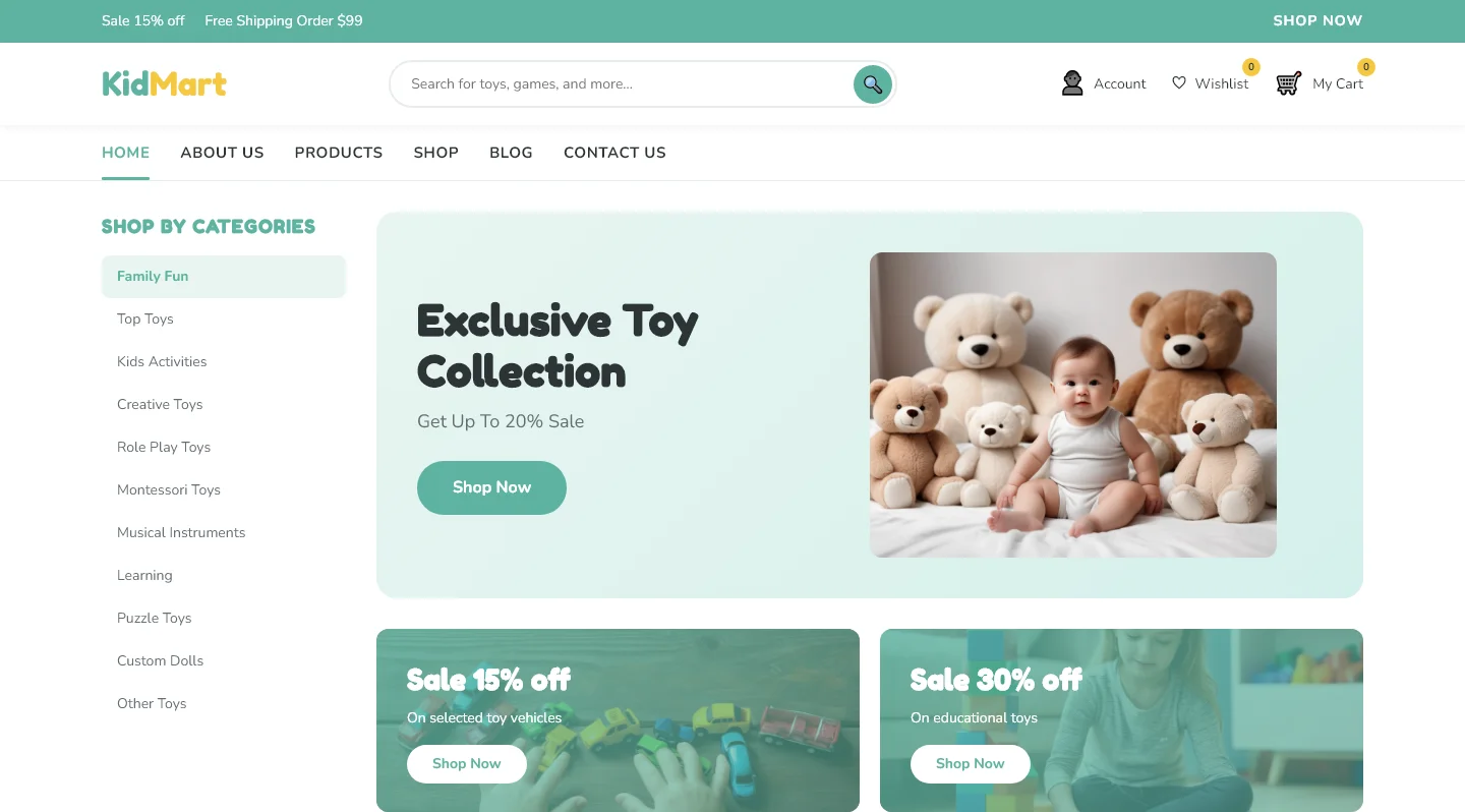
Toddle is a free HTML5 + Tailwind CSS template designed for children's education and retail websites. It ships with four pages — index, blog, contact, and shop — powered by hand-written CSS and a utility-first architecture for fast iteration.
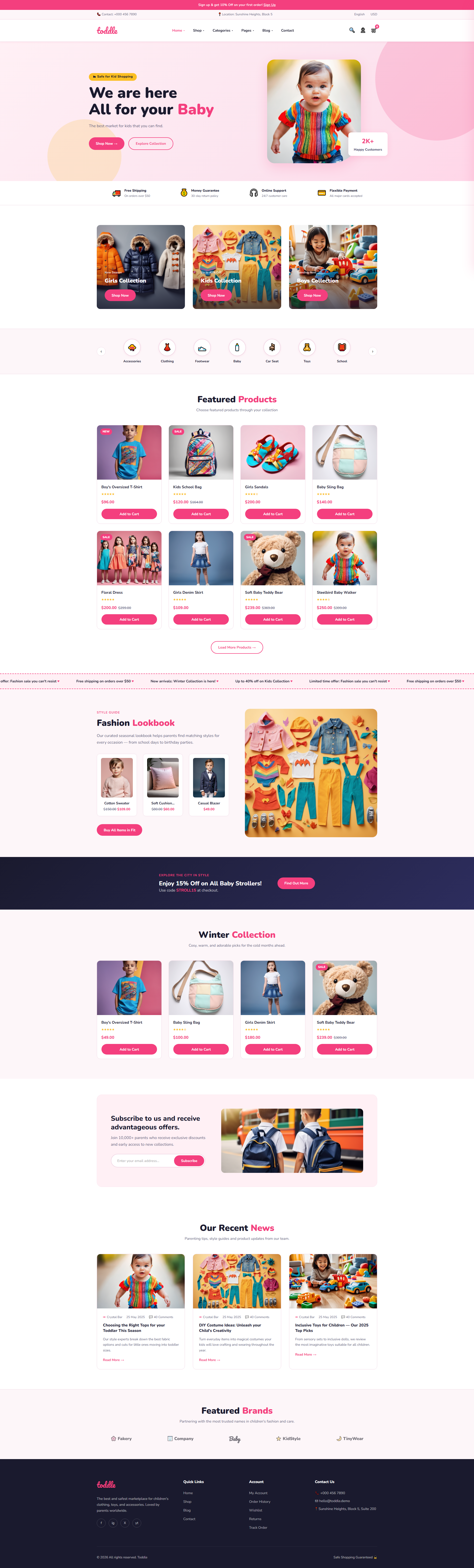
The homepage features six core sections: a hero headline, featured products grid, fashion lookbook, winter collection showcase, newsletter signup form, recent news block, and a featured brands area. The design uses a soft pastel palette with #F0F8FF backgrounds and #8A2BE2 accent color, structured for readability and visual hierarchy. Local image assets are included for immediate preview.
Key Features
- Kids Clothing Collections
- Baby Fashion Showcase
- Toddler Wear Catalog
- Free Nationwide Shipping Banner
| Tech Stack | HTML5, Tailwind CSS, JavaScript |
| Release Date | 2026-07-05 |
| License | Free (Must keep footer backlink) |
Suitable For & Use Cases
E-commerce managers at children's apparel brands, freelance web designers building portfolios for baby boutiques, and local studio owners launching online stores. Ideal for businesses needing quick deployment of mobile-optimized product catalogs. Not suited for enterprise-level SaaS platforms requiring complex user authentication workflows.
Page Sections Included
The index page features a hero banner with the headline 'We are here All for your Baby,' followed by a Featured Products section showcasing item cards, a Fashion Lookbook area, and a Winter Collection highlight. A subscription call-to-action invites visitors to subscribe for offers, then an Our Recent News section displays blog excerpts, and a Featured Brands strip rounds out the page. The shop, blog, and contact pages each serve their dedicated purpose with clean layouts.
Why We Recommend
The combination of a shop page, blog, and integrated contact/newsletter form covers most informational and transactional needs for kids-focused sites without requiring additional page templates. The hand-written CSS approach keeps the codebase transparent and easy to modify, while the pastel color scheme is already tuned for the education and children's market. Built on Tailwind v3 utility classes, it allows quick layout adjustments directly in HTML markup.
Technical Specifications
Requires Node.js v16+ and npm. Customize colors and spacing through tailwind.config.js. Production builds are generated via npm run build. Development mode uses TAILWIND_MODE=watch for live recompilation. Image assets should be compressed for optimal performance.
Ideal Use Case
Ideal for small children's clothing boutiques launching a simple storefront, educational resource hubs sharing lesson materials, family activity or tutoring service providers, and parent-focused blogs that also sell related products or accept newsletter signups. The integrated shop and blog pages support hybrid content-commerce sites without a CMS dependency.