Nexonix — Free IT & Software Website Template
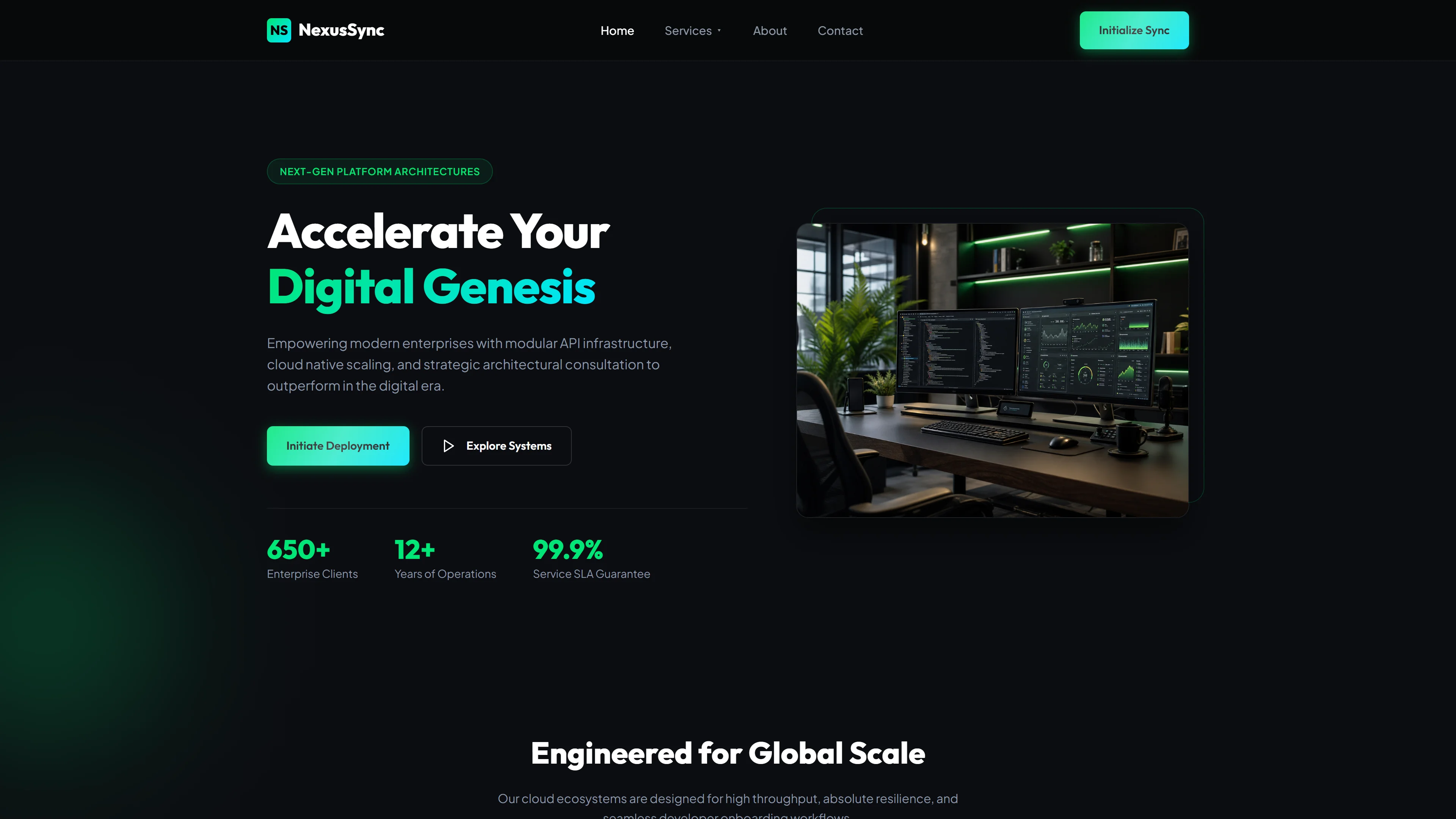
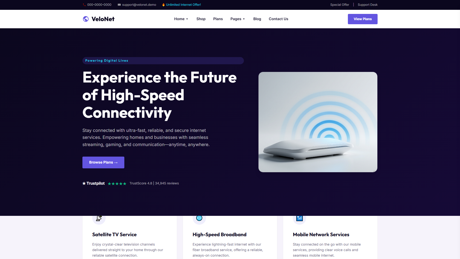
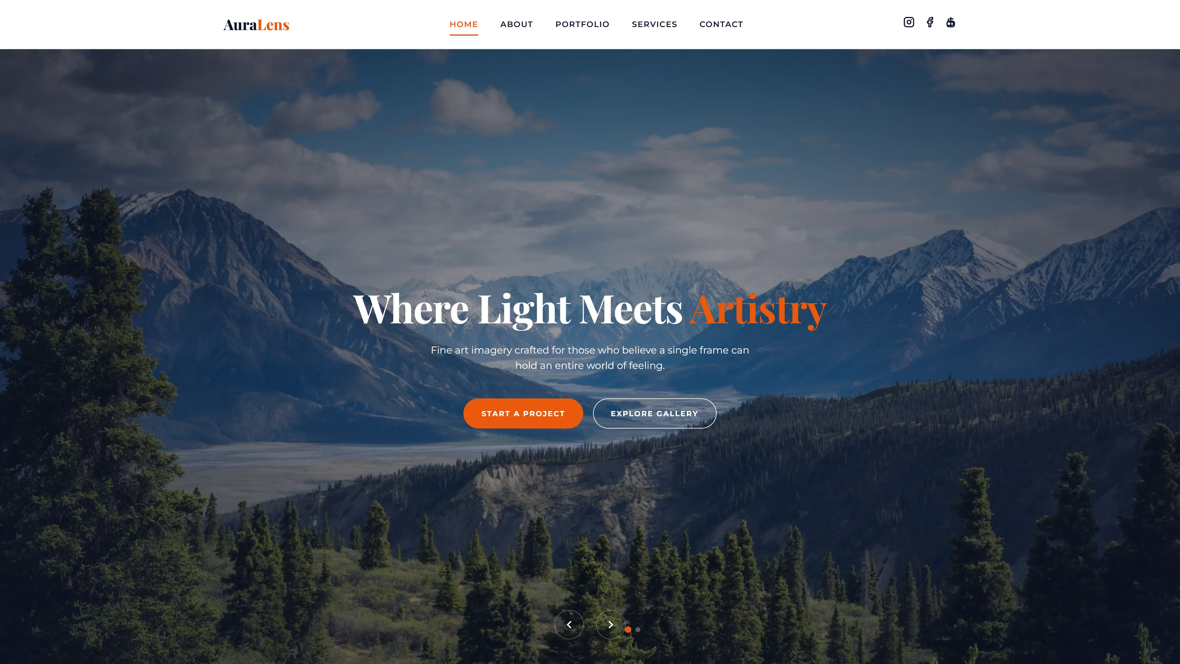
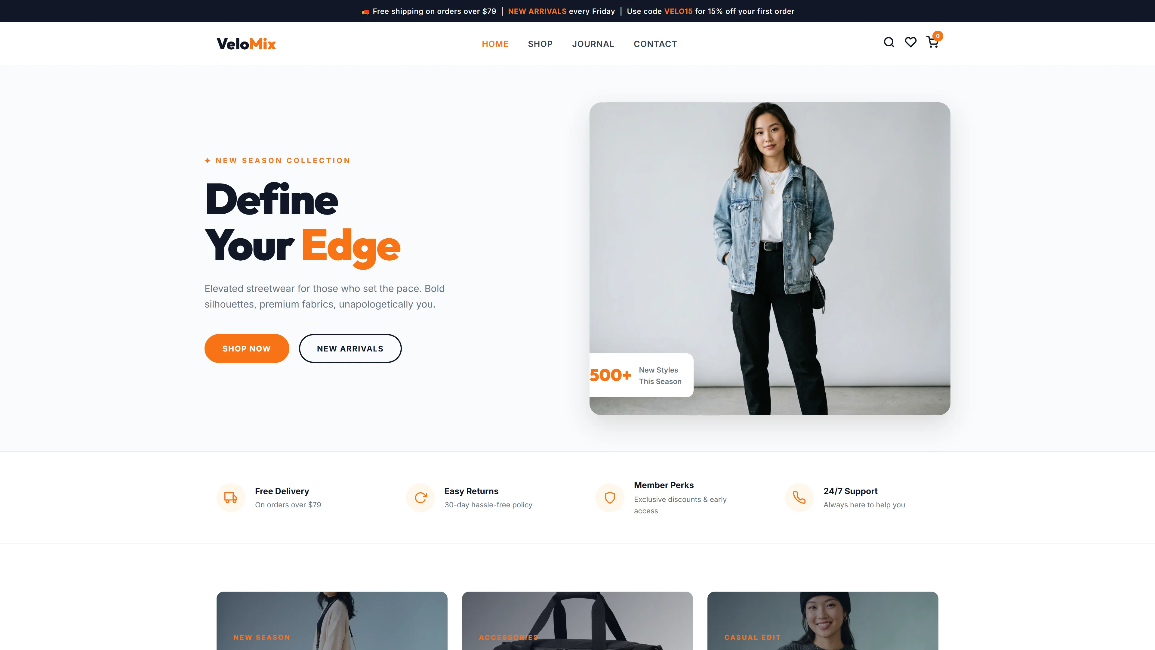
Nexonix is a free HTML5 and Tailwind CSS template designed for IT and software businesses that need a professional, high-performance online presence. It ships with 7 hand-crafted pages — index, about, services, portfolio, blog, contact, and a secondary index — all powered by hand-written CSS and vanilla JavaScript. The template includes a contact/newsletter form, 25 local images, and Google Fonts integration, giving teams full control without bloat.
Section headings on the homepage cover digital presence messaging, services, portfolio showcases, pricing plans, testimonials, team bios, and FAQs. Dark mode is supported via Tailwind's class-based strategy, and the architecture keeps bundle sizes lean by avoiding heavy third-party libraries. The template uses inline SVGs for icons, cutting HTTP requests and improving Core Web Vitals scores.
Key Features
- Mobile-First Responsive Layout
- Dark Mode Toggle with LocalStorage
- Form Validation via HTML5 + Custom JS
- SVG Icon System with Performance Optimization
| Tech Stack | HTML5, Tailwind CSS, JavaScript |
| Release Date | 2026-07-05 |
| License | Free (Must keep footer backlink) |
Suitable For & Use Cases
Ideal for technical founders, SaaS product marketers, frontend devs building landing pages, and indie hackers launching MVPs. Also fits UX writers needing structured content blocks and SEO-conscious designers wanting clean markup. Not suited for enterprise CMS integrations or complex e-commerce flows requiring cart systems or payment gateways.
Page Sections Included
Based on the FACTS, Nexonix contains 7 HTML pages: index.html, about.html, services.html, portfolio.html, blog.html, contact.html, and nexonix.html. The index page features section headings including Hero, Our Services, Why Choose Us, Our Portfolio, Flexible Pricing Plans, What Our Clients Say, Meet Our Leaders, and Frequently Asked Questions. Additional template elements include a contact or newsletter HTML form, 25 local images, and a hamburger-style mobile navigation built with vanilla JavaScript.
Why We Recommend
Nexonix delivers a clean, performance-first foundation for IT and software sites without requiring complex build tooling beyond Tailwind. The hand-written CSS approach keeps the package at just 6.1 MB, and the dark mode implementation respects user preferences while saving battery on OLED screens. Teams that need fast launches with real estate for portfolios, service listings, and lead-capture forms will find it easy to customize and deploy.
Technical Specifications
Requires Node.js v18+ and npm. Initialize Tailwind with `npx tailwindcss init -p`, configure dark mode via class strategy in tailwind.config.js, and use PostCSS for production builds. Serve via Netlify or Vercel after running `npm run build`. Customize colors under theme.extend.colors in the config file.
Ideal Use Case
Ideal for SaaS companies launching a product site, IT consultancies building service and case-study pages, software agencies showcasing portfolios, and tech startups needing a fast-loading marketing site with dark mode. The included blog and contact pages support content marketing and lead generation out of the box.