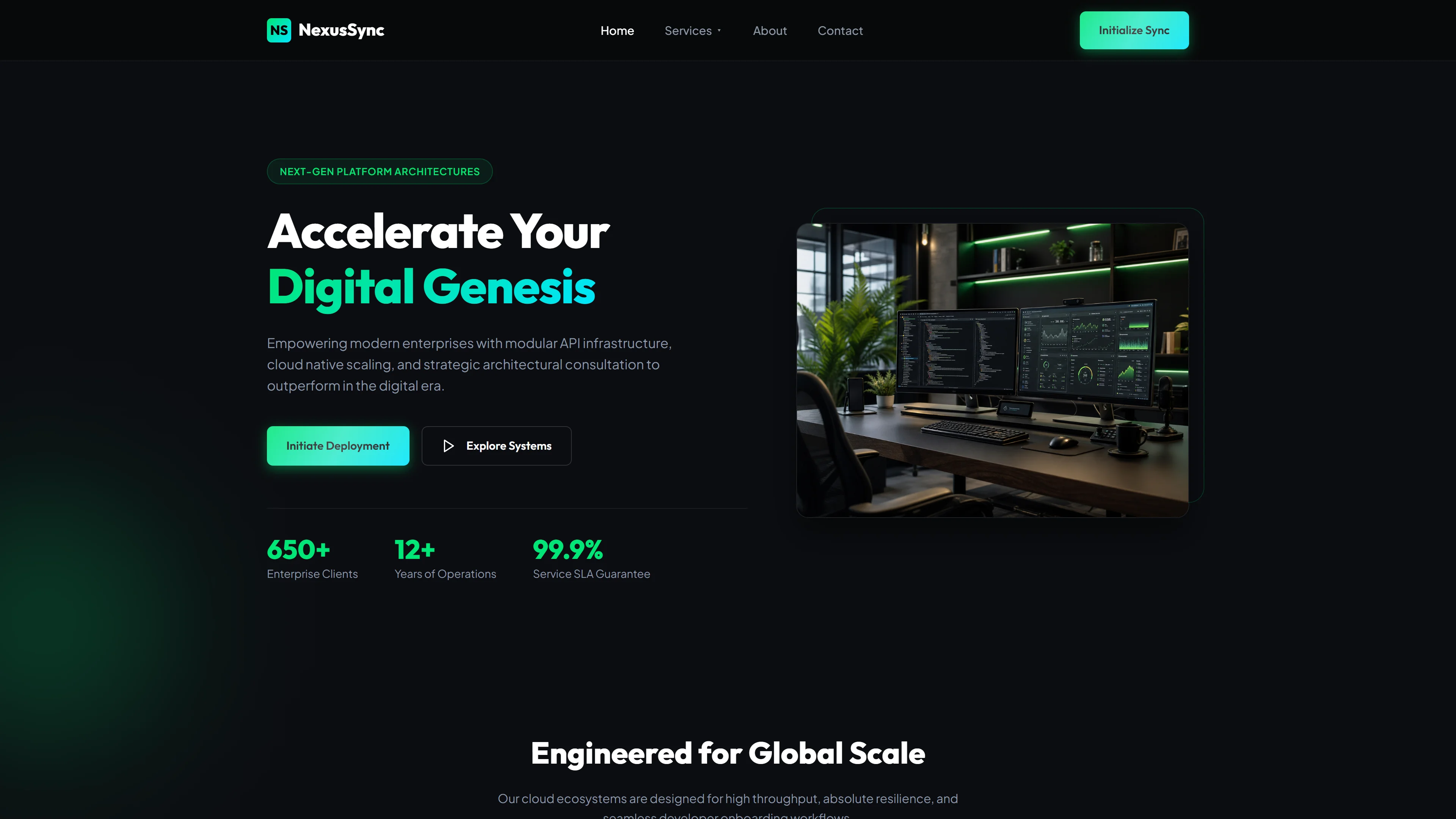
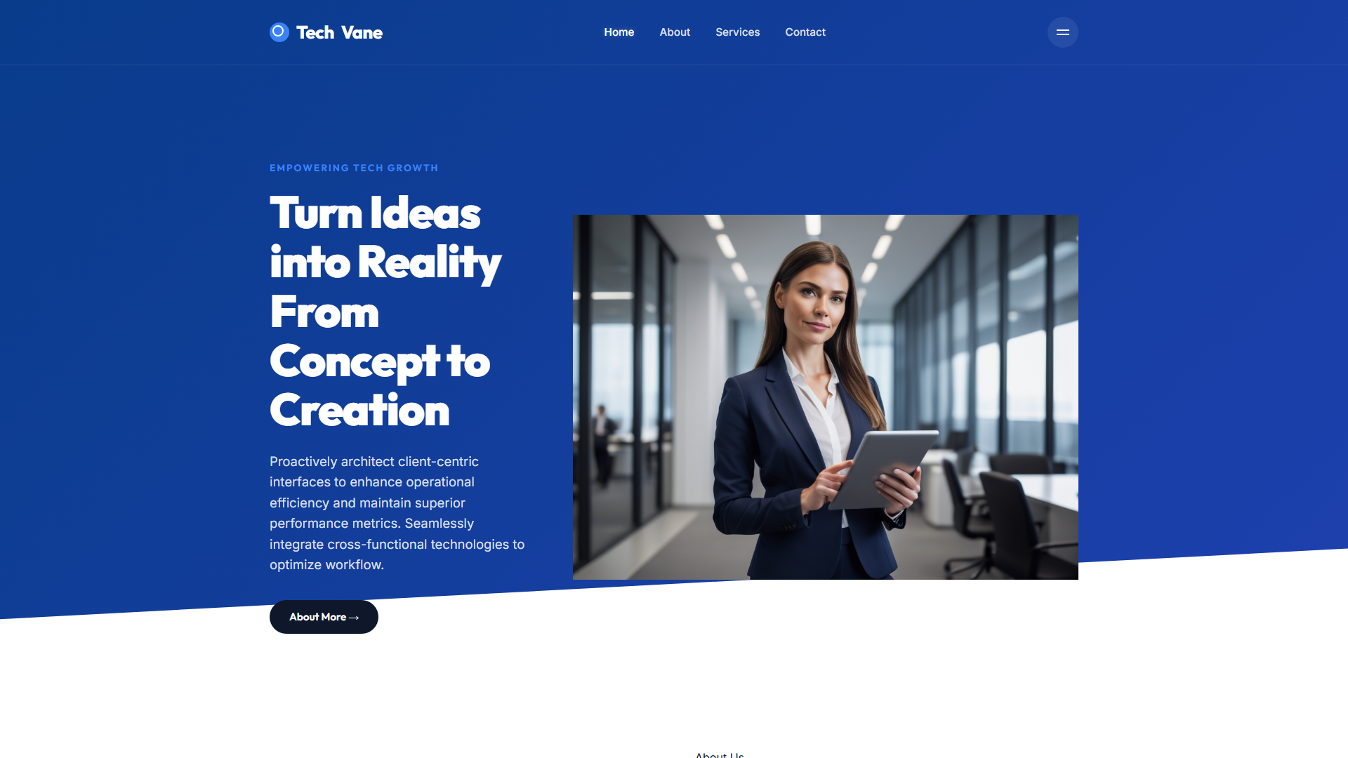
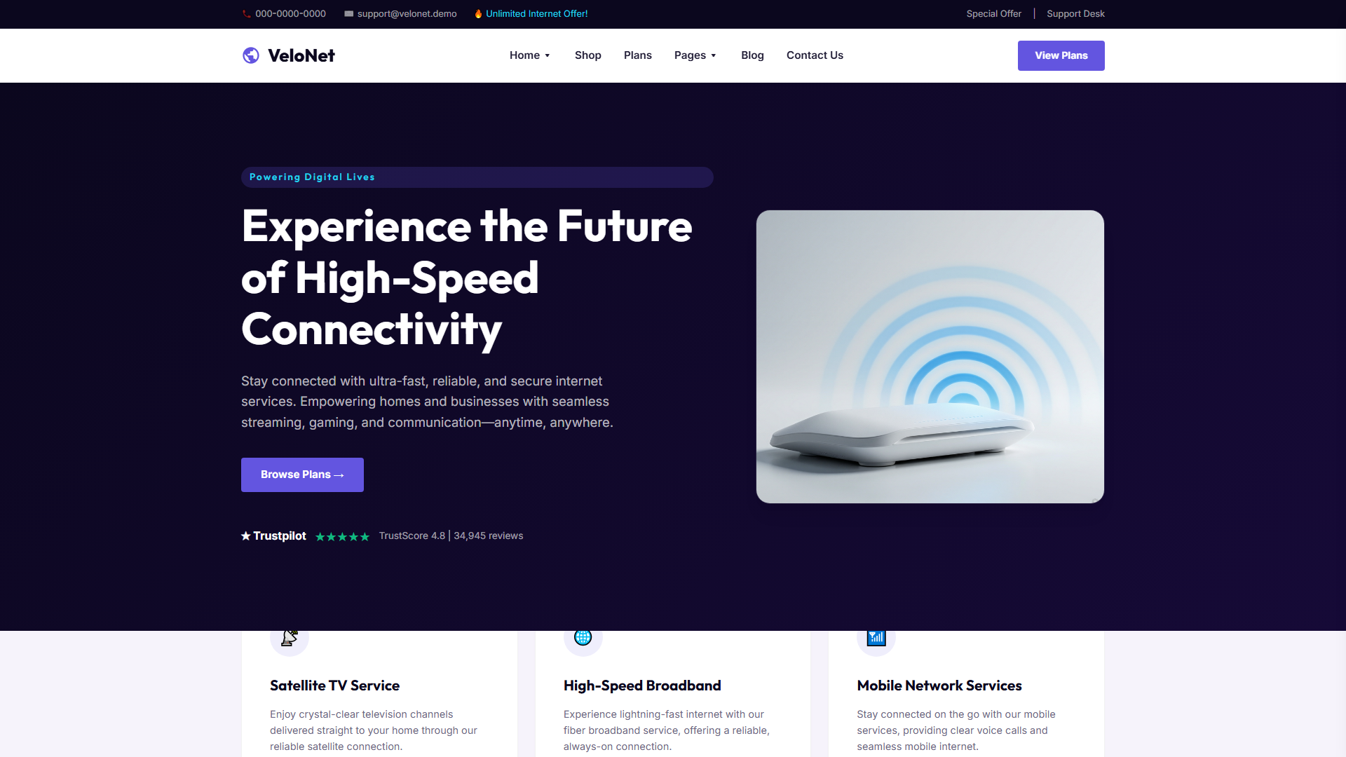
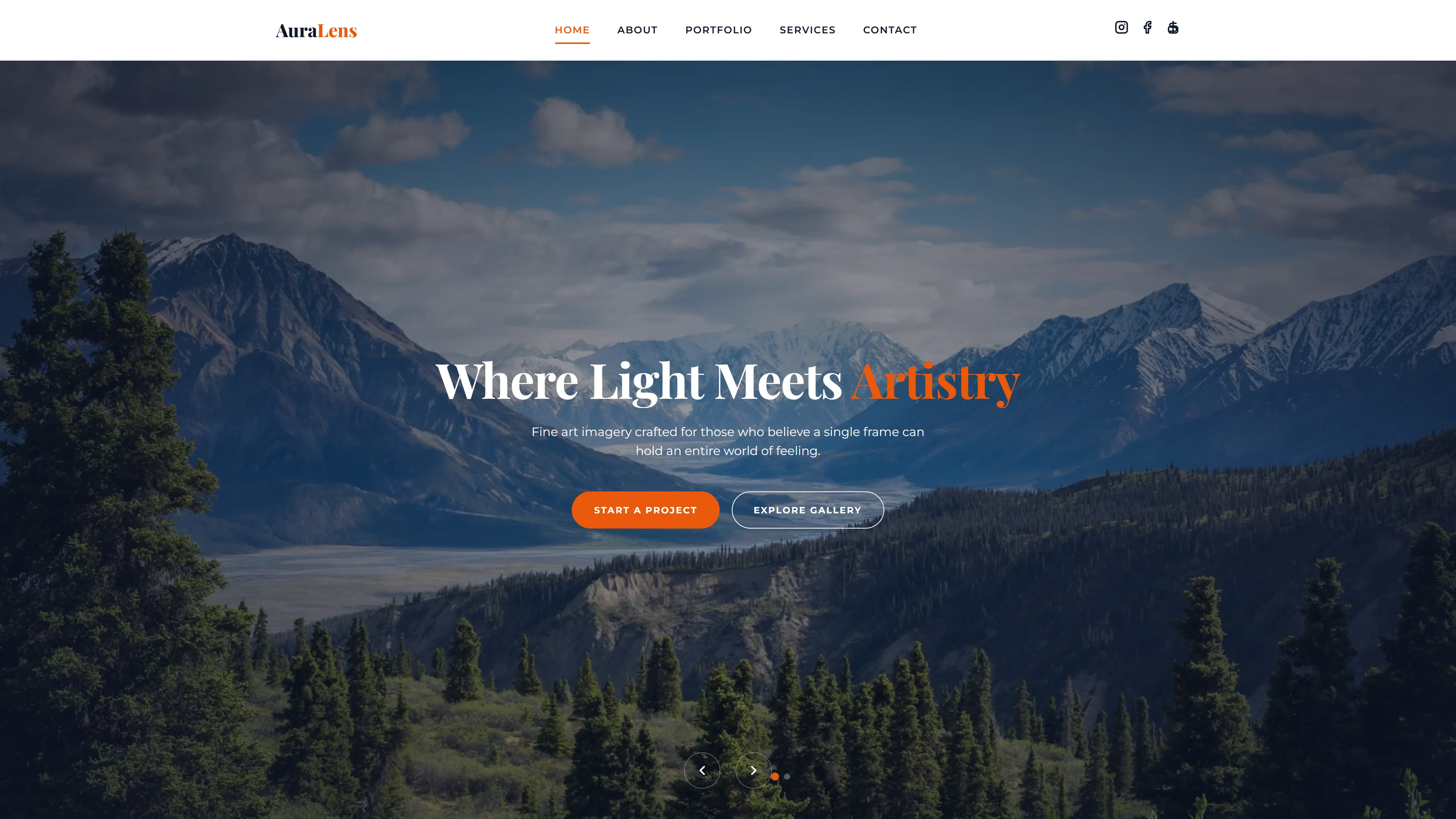
ITCEKO — Free IT & Software Website Template
ITCEKO is a free HTML website template built for IT and software businesses that need a clean, professional online presence. Constructed with HTML5, Tailwind CSS, and JavaScript, it ships as a 5.0 MB package containing hand-written CSS and no heavy animation libraries—just lightweight, maintainable code. The template includes seven HTML pages covering the essentials: a homepage, about page, services listing, service detail pages, a blog detail view, and a contact page with an integrated newsletter form.
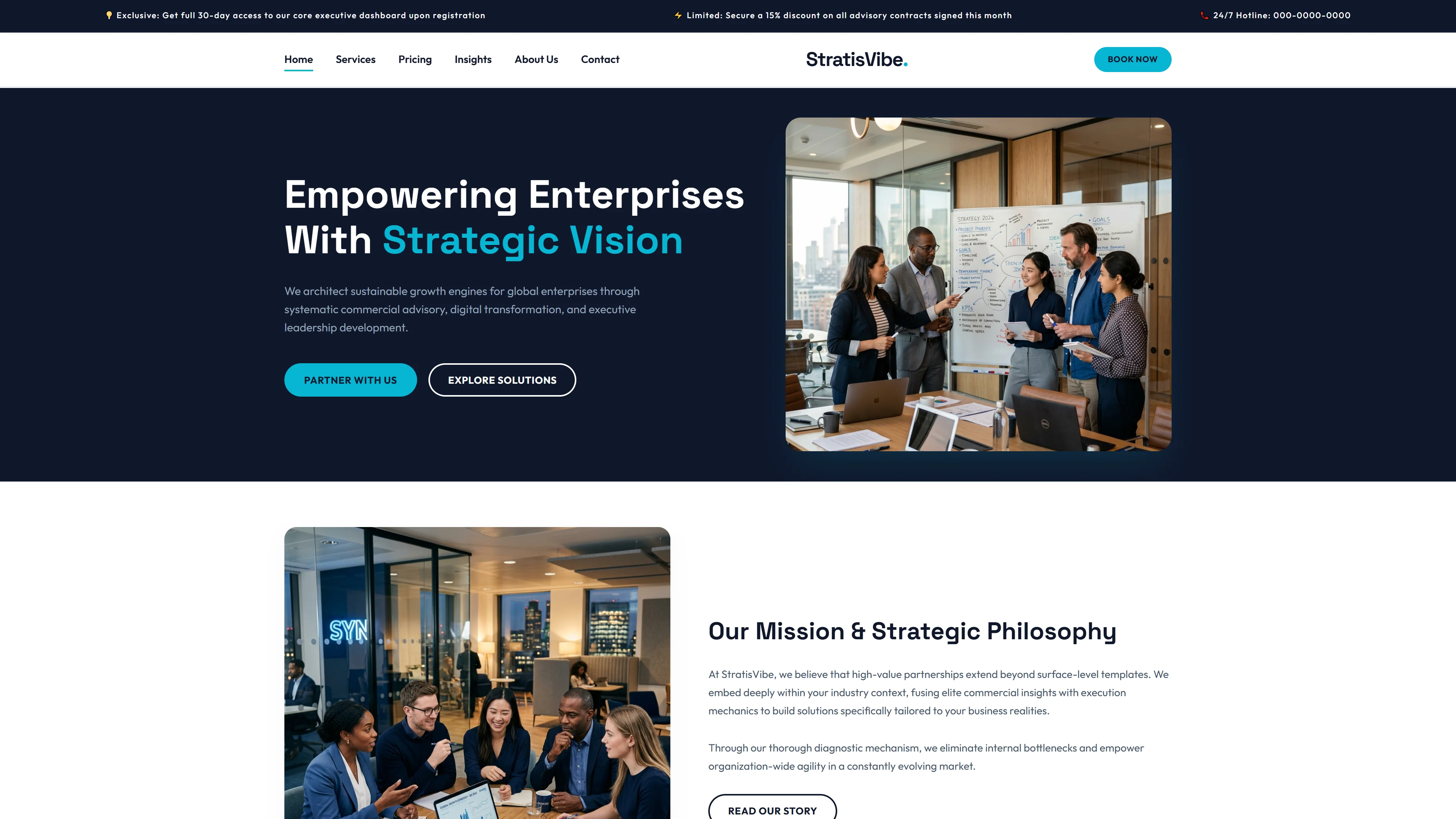
The homepage features clearly defined sections including a hero area around IT solutions and technology services, a software solutions showcase, client flexibility messaging, expert IT strategy and planning content, computer systems management highlights, customer reviews, and a newsletter subscription block. Sixteen local images are included and ready for replacement. The structure is designed to give developers a solid starting point without unnecessary bloat.
Key Features
- High-Performance Grid Layouts
- Dark Mode Ready
- Mobile-First Components
- SEO Optimized Structure
| Tech Stack | HTML5, Tailwind CSS, JavaScript |
| Release Date | 2026-07-05 |
| License | Free (Must keep footer backlink) |
Suitable For & Use Cases
Frontend developers, SaaS startups, IT consulting firms, and digital transformation agencies looking for a fast, customizable base. Not suited for content-heavy blogs or e-commerce stores requiring cart functionality.
Page Sections Included
The template contains seven pages with sections drawn from the index headings: a hero area focused on IT solutions and technology services, a software solutions and design tools section, a client flexibility and agility section, an expert IT strategy planning and implementation section, a computer systems management and maintenance section, a customer review section, a newsletter subscription section, and a frequently asked questions section. Additional pages cover about, services, service detail, blog detail, and contact.
Why We Recommend
ITCEKO gives developers a lean, production-ready foundation for IT and software company sites. The hand-written CSS paired with Tailwind utility classes keeps the build lightweight and avoids dependency on animation libraries. Seven purpose-built pages cover the typical content needs of this vertical, and the included contact and newsletter forms give you lead capture from day one. Replacing the 16 local placeholder images is straightforward thanks to the simple markup.
Technical Specifications
This template requires a standard static hosting environment. Node.js is needed only if you want to customize the Tailwind build. Run npm install to set up dependencies, then compile Tailwind styles with npx tailwindcss. Replace local images and edit HTML content directly. No database or backend is required to run the template as-is.
Ideal Use Case
IT consultancies, managed service providers, and software development agencies can use ITCEKO as a fast-launch template for marketing their technical services. The services and service-detail pages support detailed offerings, while the about and contact pages handle credibility and lead generation. The blog detail page also accommodates technical content or industry updates.