ITSolutions — Free IT & Software Website Template
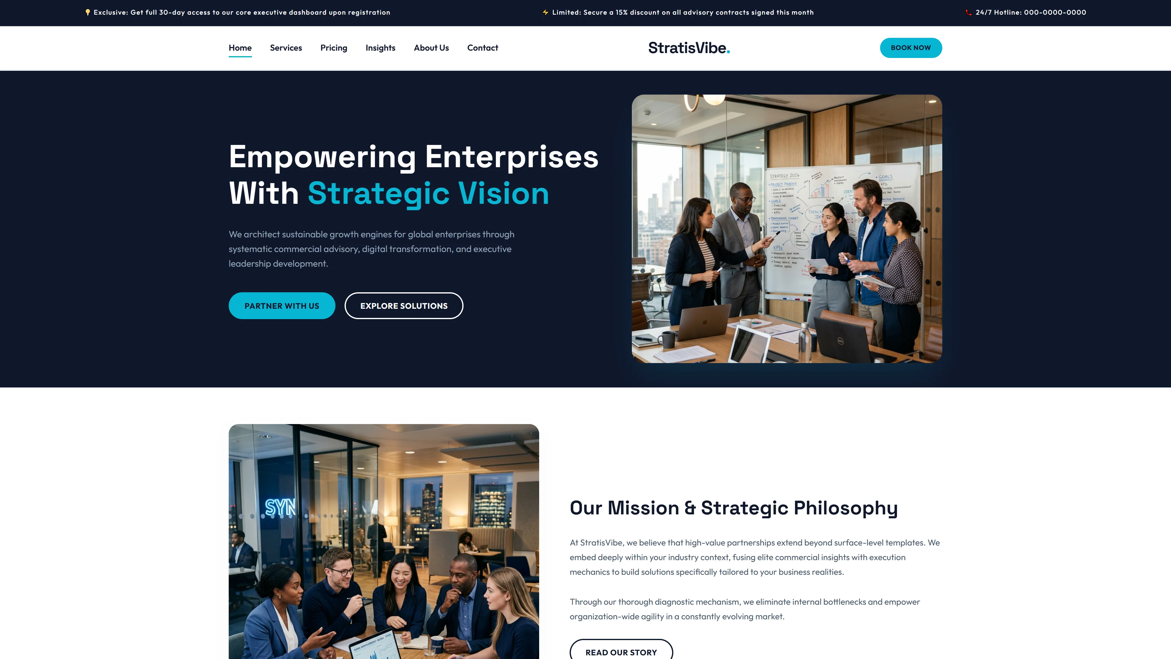
ITSolutions is a 9-page HTML5 template built with Tailwind CSS, designed specifically for IT services and software companies. The package includes pages for about, services, portfolio, project detail, service detail, blog detail, contact, and a landing homepage — all structured around a professional, modern layout.
The CSS is hand-written rather than framework-heavy, with no notable animation libraries detected. This keeps the codebase straightforward to modify. The template includes a contact/newsletter form, 7 local images, and section headings that map to typical IT business pages: digital innovation, enterprise solutions, process, clients, projects, testimonials, and call-to-action.
Key Features
- Digital Transformation Showcase
- Client Booking Integration
- Tech Stack Highlight
- Performance Optimized
| Tech Stack | HTML5, Tailwind CSS, JavaScript |
| Release Date | 2026-07-05 |
| License | Free (Must keep footer backlink) |
Suitable For & Use Cases
Startup CTOs, freelance dev agencies, and solo consultants offering digital transformation or automation services. Ideal for pitch decks, client onboarding pages, or MVP showcase sites. Not suited for e-commerce stores needing payment gateways or complex user authentication flows. Software and SaaS companies expanding to overseas markets with a global product website.
Page Sections Included
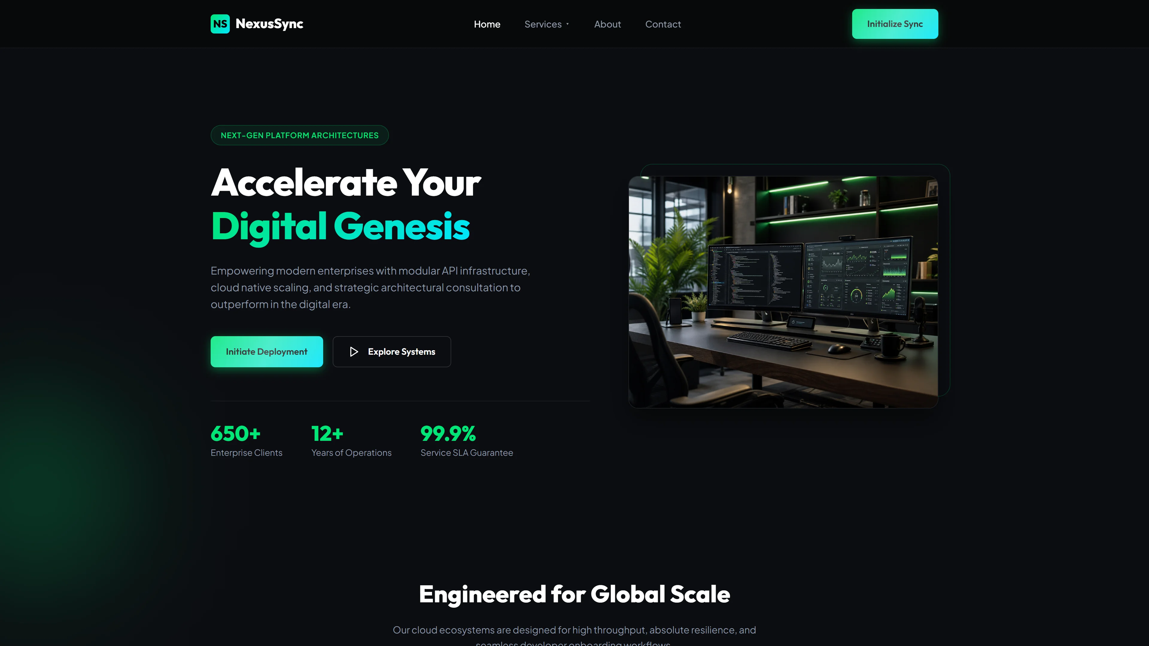
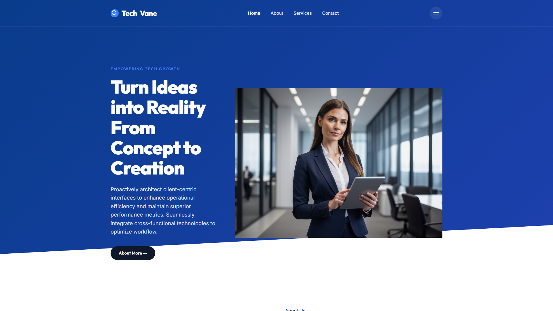
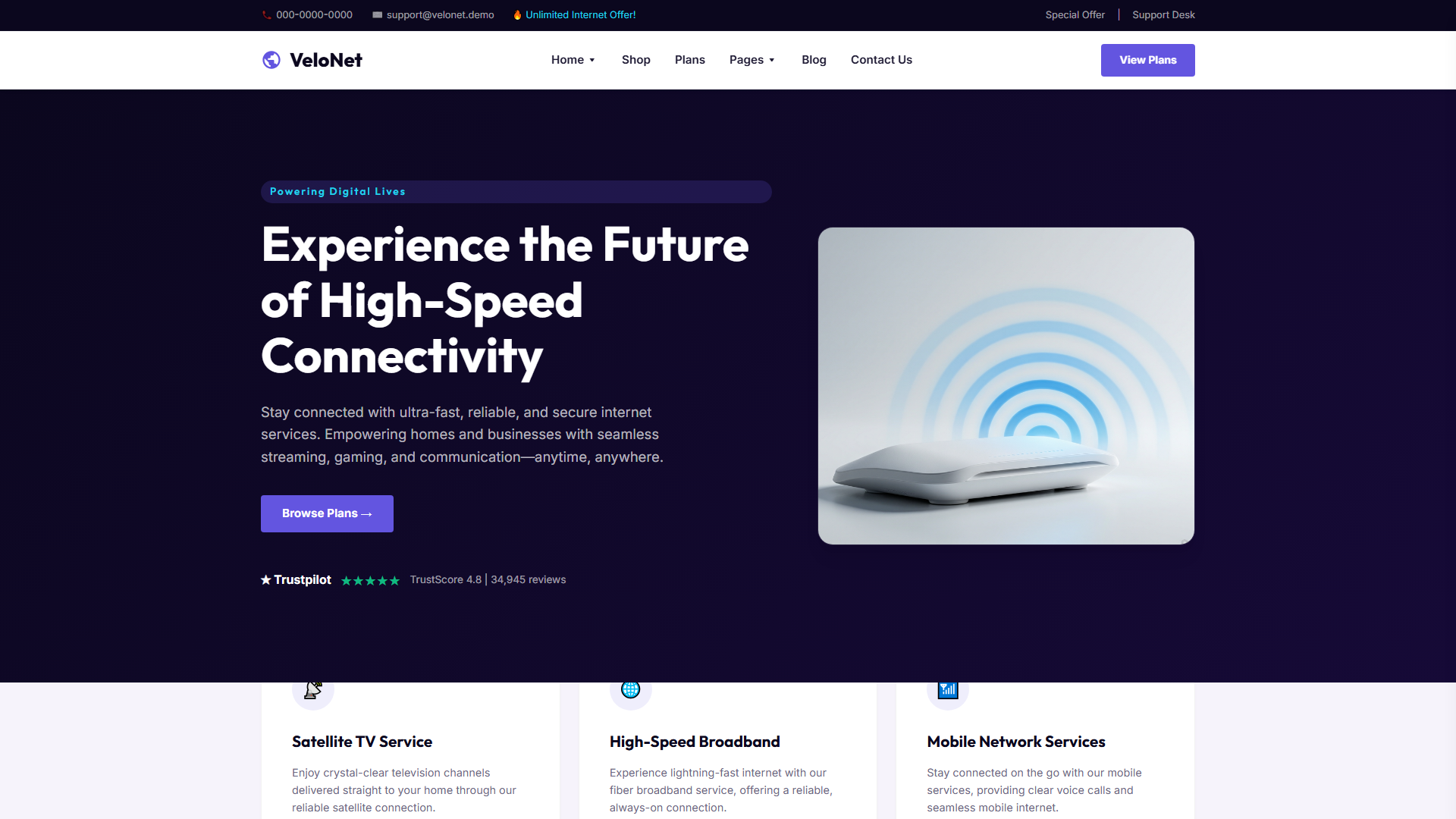
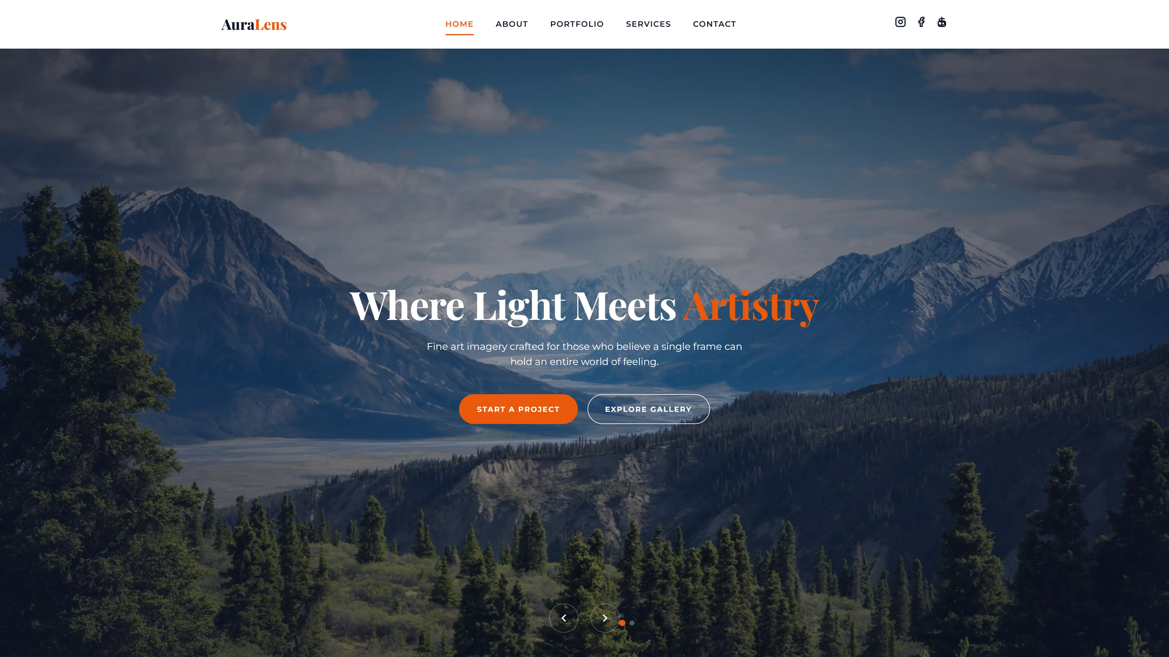
Full‑screen hero with headline, comprehensive IT solutions overview, enterprise‑grade solutions detail, step‑by‑step process explanation, client trust testimonials, completed projects gallery, customer review slider, and a contact call‑to‑action. Supporting pages cover about, blog details, contact form, portfolio grid, project details, service specifics, and additional services listing.
Why We Recommend
It covers a full IT service business site without requiring complex build tooling. The hand-written CSS and absence of heavy animation libraries mean the code is easier to maintain and customize. Tailwind CSS provides utility-first flexibility for quick styling adjustments. The inclusion of multiple inner pages — services, portfolio, blog — gives a complete starting structure for deployment.
Technical Specifications
Node.js v18+, npm, and Tailwind CSS v3.4+. Customize colors in tailwind.config.js using hex or RGB values. For production, run npx tailwindcss -o dist/style.css --minify. Use PostCSS if integrating with Webpack or Vite.
Ideal Use Case
Ideal for IT consultancies, managed service providers, and software firms that need a complete multi-page presence quickly. Deploy as a static site on Netlify or Vercel, customize the Tailwind config for brand colors, swap placeholder content with actual service listings and portfolio projects, then connect the form to any backend.