Veritas Legal Chambers — Free Legal Services Website Template
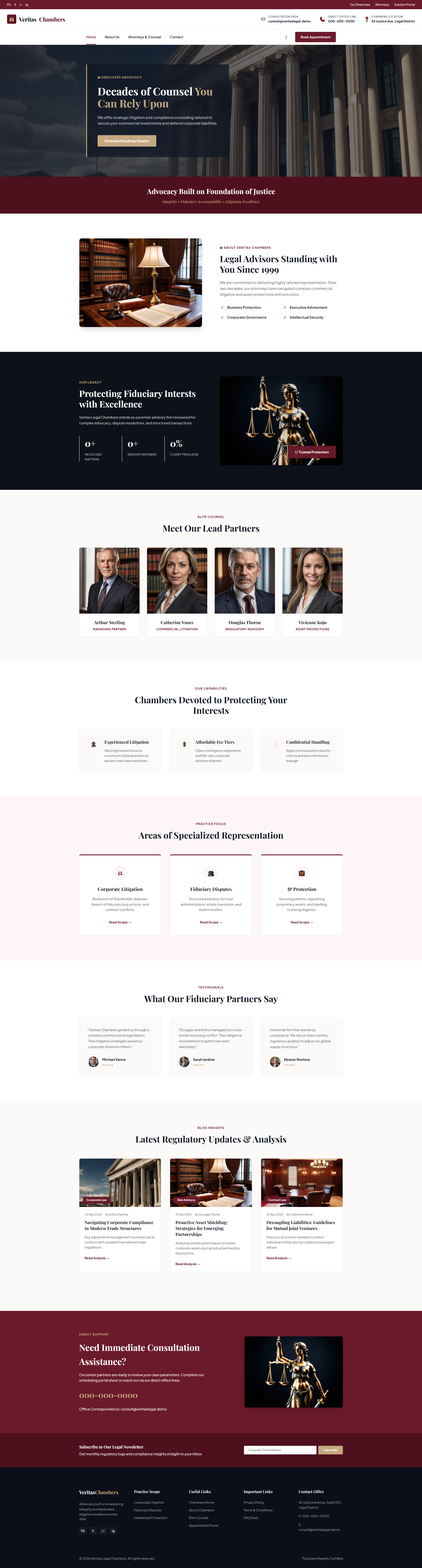
This template provides a professional structure for law firms seeking a polished online presence. Built with HTML5 and Tailwind CSS, it features hand-written CSS for custom styling across four pages including about, attorneys, contact, and homepage. The design emphasizes readability with clear section hierarchy—headings like 'Decades of Counsel You Can Rely Upon' and 'Protecting Fiduciary Rights Globally' establish trust. A contact form supports lead capture, while twelve local images allow customization with firm-specific visuals. The layout uses responsive techniques compatible with modern browsers.
Key Features
- Civil Advocacy
- Business Litigation
- Intellectual Property
- Defense Counseling
| Tech Stack | HTML5, Tailwind CSS, JavaScript |
| Release Date | 2026-07-05 |
| License | Free (Must keep footer backlink) |
Suitable For & Use Cases
Law firm managing partners, solo practitioners building private practice sites, legal tech startups, and boutique litigation firms seeking a fast, SEO-friendly web presence. Ideal for attorneys using HubSpot or Mailchimp for outreach. Not suited for criminal defense teams requiring case management dashboards or e-commerce integration.
Page Sections Included
Homepage features hero heading Decades of Counsel You Can Rely Upon, followed by fiduciary rights protection, justice-based advocacy messaging, since-1999 credibility statement, excellence commitment, lead partners introduction, interests protection philosophy, and specialized representation areas. About page, attorneys bio grid, and contact form complete the four-page structure.
Why We Recommend
The semantic HTML structure with proper heading hierarchy supports accessibility and search engine visibility. Hand-written CSS rather than heavy frameworks keeps the package at 5.4 MB manageable. The contact form includes built-in validation patterns without requiring external libraries. Navigation across four pages creates a logical flow for prospective clients researching firm credentials.
Technical Specifications
Built with HTML5, Tailwind CSS, and vanilla JavaScript. No build tools required—files can be customized directly. Images stored locally at twelve files. Contact form uses standard HTML submission; integrate with services like Formspree if backend processing needed. No external animation libraries detected. Deploy via static hosting such as Netlify or GitHub Pages.
Ideal Use Case
A mid-size regional law firm could use this template to establish credibility for corporate practice areas. The attorneys page structure supports partner bios and specialization listings. The contact form captures consultation requests, while the about page conveys firm history and values. This suits firms prioritizing professional presentation over complex interactive features.