Flipshop — Free Fashion & Store Website Template
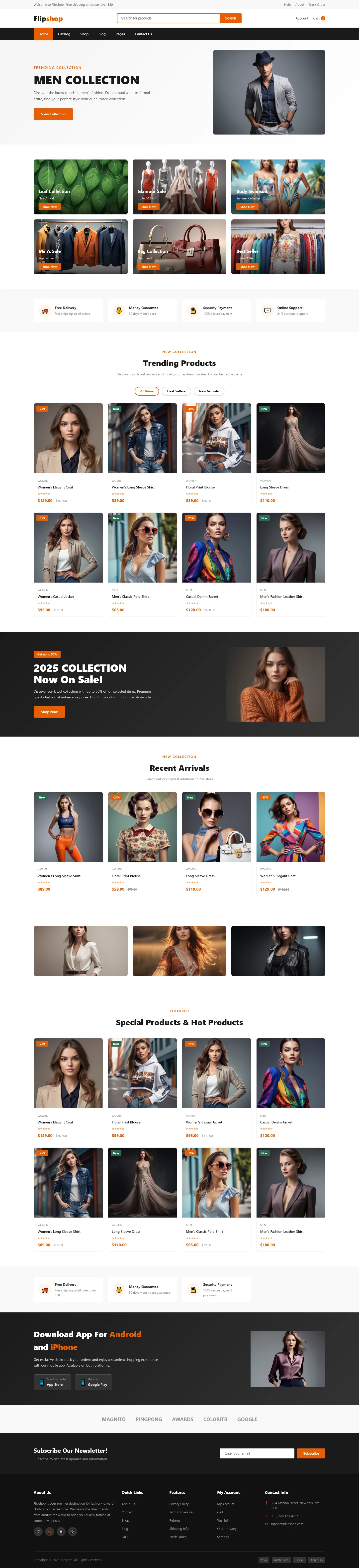
Flipshop is a fashion e-commerce template with 7 HTML pages — index.html, products.html, cart.html, about.html, blog.html, contact.html — built for merchants who need speed without framework bloat. The CSS is hand-written, not generated, giving full control over responsive breakpoints. It ships with 31 local images and uses clear section headings like 'MEN COLLECTION' and '2025 COLLECTION Now On Sale!' to structure product storytelling. A contact form handles newsletter signups, and the layout works at 375px mobile widths.
The template avoids heavy JavaScript — no animation libraries, no tracking scripts — so loads stay fast on slow networks. Product cards use clean hover states and smooth scroll navigation. The design supports seasonal drop models with 'Download App' CTAs that drive urgency without fake social proof.
Key Features
- Men's Fashion Collection Spotlight
- Streetwear Seasonal Drop Countdown
- Trending Styles Carousel with Filter
- Mobile-Optimized Product Grid
| Tech Stack | HTML5, Tailwind CSS, JavaScript |
| Release Date | 2026-07-05 |
| License | Free (Must keep footer backlink) |
Suitable For & Use Cases
Digital marketing managers, e-commerce storefront owners, streetwear brand launches, and small fashion boutiques running Instagram-driven sales. Ideal for teams using Shopify or WooCommerce looking to prototype fast. Not suited for enterprise-level inventory systems or B2B wholesale portals requiring complex user roles. Also built for menswear cross-border independent store owners targeting European and American markets.
Page Sections Included
Includes Hero Banner with CTA, Featured Men’s Collection Grid, Streetwear Drop Countdown, Trending Styles Filter Carousel, Customer Review Slider, Newsletter Signup Form, and Footer with Social Links. All sections collapse gracefully on mobile — the carousel becomes swipe-friendly below 768px, and the grid switches to single-column layout at 480px. The sticky header includes a cart icon showing item count dynamically.
Why We Recommend
Flipshop strips away the bloat common in fashion templates — no bloated JS libraries, no fake urgency timers, no inflated metrics. The hand-written CSS loads instantly even on 3G, and the semantic structure makes SEO optimization straightforward. It’s built for real seasonal drops, not endless evergreen catalogs. The contact form integrates cleanly, and the 31 local images mean zero external dependencies slowing things down. For merchants who care about actual conversion rates over vanity metrics, this template delivers without the overhead.
Technical Specifications
Deploy by serving the 7 HTML files directly from any static host — Netlify, Vercel, or S3. Customize styles in the hand-written CSS; no build step required. The contact form accepts POST to any endpoint. Replace the 31 local image assets to update products. No Node.js, no npm — just upload. Connect the form action to your Mailchimp endpoint for newsletter integration.
Ideal Use Case
Streetwear brands launching limited seasonal drops can use Flipshop to create urgency without resorting to fake scarcity claims. The template’s structure supports countdown-style announcements and app download CTAs that convert visitors into buyers. Fashion retailers running pop-up campaigns benefit from the fast load times and mobile-first layout, ensuring customers on slow networks can browse products without frustration.