Solveta: IT Solutions for Modern Business — मुफ़्त IT और सॉफ़्टवेयर वेबसाइट टेम्पलेट
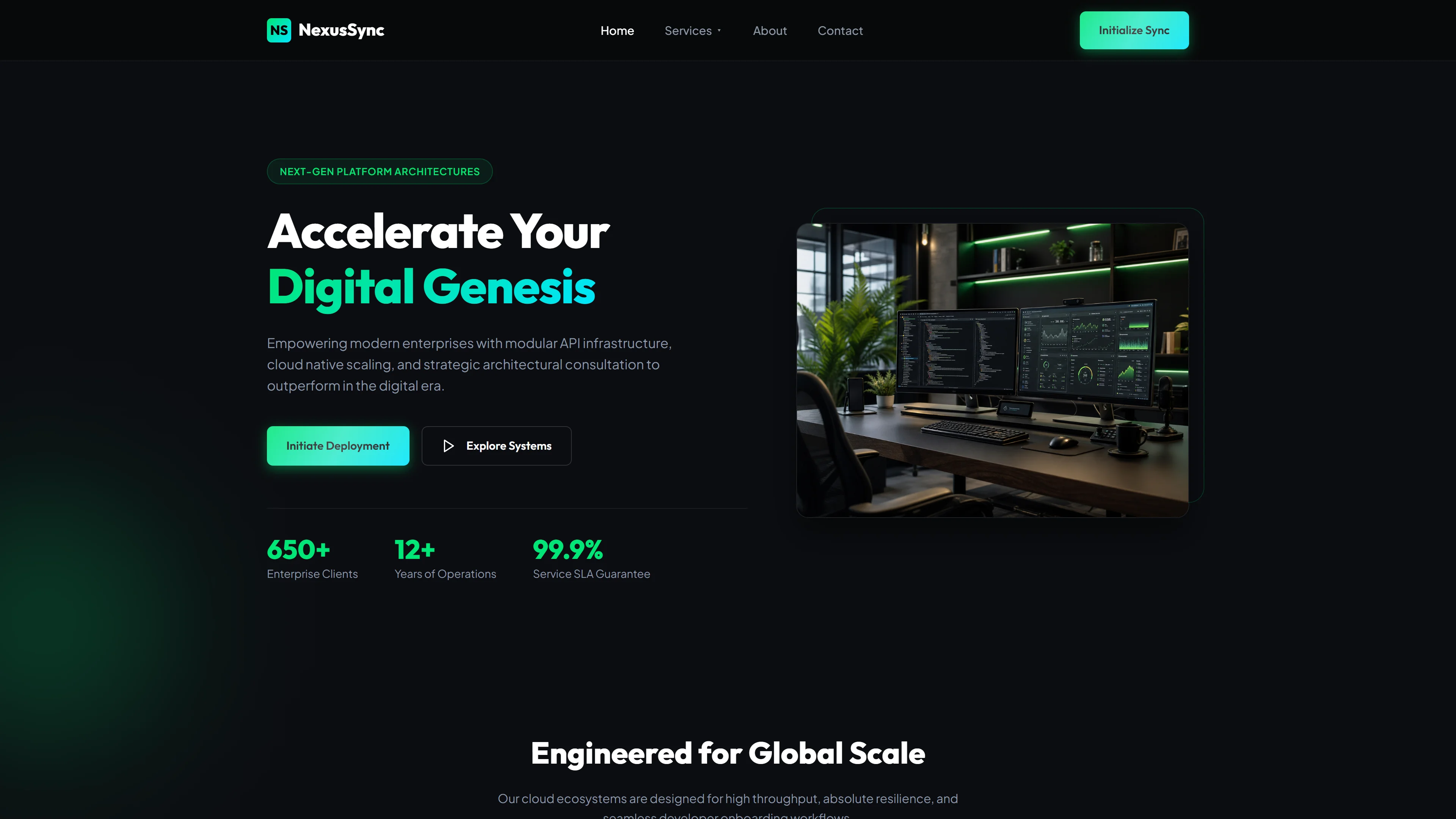
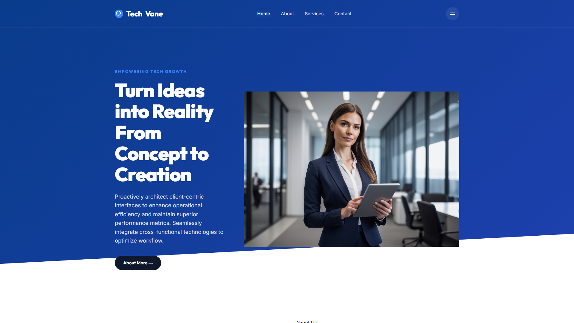
Solveta एक मुफ्त HTML5 टेम्पलेट है जो Tailwind CSS और vanilla JavaScript से बनाया गया है, जिसका डिज़ाइन उन IT और सॉफ्टवेयर कंपनियों के लिए किया गया है जिन्हें एक तेज़, साफ़ शुरुआती बिंदु की ज़रूरत है। पैकेज 7.1 MB का है और इसमें सात तैयार-कस्टमाइज़ करने योग्य पेज शामिल हैं: index, about, services, portfolio, blog, contact, और एक समर्पित Solveta लैंडिंग पेज। डिज़ाइन में भारी फ्रेमवर्क के बजाय हैंड-राइटन CSS का उपयोग किया गया है, जिसमें Google Fonts टाइपोग्राफी संभालता है। इकाई टेम्पलेट के साथ 22 स्थानीय छवियाँ शामिल हैं, और संपर्क पेज में न्यूज़लैटर या लीड-कैप्चर वर्कफ़्लो के लिए उपयुक्त एक HTML फॉर्म शामिल है।
Index पेज पर स्ट्रक्चर में कॉमन IT बिज़नेस टॉपिक्स — custom software development, digital transformation, pricing packages, FAQs, case studies, और blog insights — कवर करते हैं, जो पहले दिन से ही एक रियलिस्टिक कंटेंट स्ट्रक्चर देते हैं। कोई बिल्ड स्टेप ज़रूरी नहीं है; टेम्पलेट किसी भी मॉडर्न ब्राउज़र में index.html खोलते ही काम करना शुरू कर देता है।
मुख्य विशेषताएँ
- आईटी समाधान
- प्रौद्योगिकी सेवाएं
- विशेषज्ञ सहायता
- व्यावसायिक आईटी
| टेक स्टैक | HTML5, Tailwind CSS, JavaScript |
| रिलीज़ डेट | 2026-07-05 |
| लाइसेंस | मुफ़्त (फ़ुटर बैकलिंक रखना ज़रूरी) |
उपयुक्तता और उपयोग
Frontend developers building landing pages for SaaS startups, freelance tech consultants, or small IT firms offering cloud migration, API integration, or cybersecurity services. Ideal for agencies needing to showcase case studies with performance metrics. Also fits demo sites for open-source tools or DevOps platforms where clarity and speed matter more than flashy animations.
शामिल पेज सेक्शन
Hero section with CTA above the fold, Features list using SVG icons, Technology Stack display with filterable badges, Client Testimonials carousel, Service Pricing table with comparison toggle, Contact form integrated with Formspree, Footer with social links and sitemap navigation. All sections are modular and can be reordered via simple HTML drag-and-drop.
हम क्यों सुझाते हैं
Solveta में अनावश्यक डिपेंडेंसीज़ हटा दी गई हैं जबकि प्रोफेशनल लेआउट बनाए रखे गए हैं जो IT सर्विस प्रोवाइडर्स के लिए नेचुरली मैप होता है। सात-पेज की स्ट्रक्चर उस फ़ुल इन्फॉर्मेशनल जर्नी को कवर करती है जो एक बिज़नेस विज़िटर अपेक्षित करता है, और हैंड-राइटन CSS फ़ाइल साइज़ को मैनेज करने योग्य रखती है। Tailwind config से परिचित डेवलपर्स कलर्स और स्पेसिंग को ज़ुबानी कंपोनेंट लाइब्रेरी के साथ झगड़े के बिना जल्दी बदल सकते हैं। संपर्क फॉर्म इतना सिंपल है कि बिना बैकएंड कोड के Formspree या Netlify Forms से कनेक्ट किया जा सकता है।
तकनीकी विशिष्टताएँ
Tailwind CSS का उपयोग किया गया है, इसलिए config फ़ाइल को एडिट करने के लिए बिल्ड टूलिंग के लिए एक working Node environment की ज़रूरत है। अन्यथा टेम्पलेट plain static HTML के रूप में चलता है — browser में index.html सीधे खोलें। autocomplete के लिए VS Code with Tailwind IntelliSense की सलाह दी जाती है। किसी भी static host जैसे GitHub Pages, Netlify, या Vercel से डिप्लॉय करें। बेहतर परफॉर्मنس के लिए स्टैक को HTML/CSS/JS के रूप में रखें; जब तक hydration की योजना न हो, React या Vue wrappers न जोड़ें।
आदर्श उपयोग का मामला
छोटी और मध्यम-आकार की IT कंसल्टेंसीज़, फ्रीलांस डेवलपर्स, और सॉफ्टवेयर शॉप्स के लिए जो CMS के बिना एक मल्टीलिंग्युअल-रेडी स्टैटिक साइट चाहते हैं। इसे किसी डेव एजेंसी के लिए सिंगल-लोकेशन लैंडिंग हब, किसी सोलो कंसल्टेंट के लिए पोर्टफोलियो-प्लस-ब्लॉग कॉम्बो, या किसी रेजीऑनल MSP के लिए सर्विस कैटलॉग के रूप में उपयोग करें। स्टैटिक HTML आउटपुट इसे GitHub Pages, Netlify, या Vercel डिप्लॉयमेंट के लिए equally उपयुक्त बनाता है।