Why Generic "Website Tips" Fail
Search "how to build a website" and you'll get thousands of articles saying "choose a good design, add content, optimize for mobile." That's like telling a chef "cook good food." Technically correct, practically useless.
Every industry has specific needs, expectations, and conversion patterns. A restaurant website that works beautifully would be terrible for a student portfolio. Here's what actually matters for each type.
Restaurant Websites: What Actually Gets Customers Through the Door
Most restaurant websites make the same mistake: they look pretty but don't answer the questions customers actually have. Here's what matters:
- Menu front and center: Don't hide your menu behind a PDF download. Put it directly on the page, searchable, with prices visible. 70% of visitors come to check the menu before deciding.
- Photos of actual dishes: Not stock photos. Real food photography. One great photo of your signature dish does more than 1,000 words of description.
- Hours, location, phone — above the fold: Don't make people hunt for this. It should be visible the moment the page loads.
- Google Maps embed: Make it one click to get directions. Most restaurant searches happen on mobile, from nearby.
- Reservation or order link: If you accept reservations or takeout orders, make the button impossible to miss.
Unique insight: Add a "popular dishes" section with short descriptions. This isn't just about showing food — it's about reducing decision fatigue. When customers arrive, they already know what to order. Your restaurant website becomes a sales tool, not just a digital business card.
Student Graduation Project Websites: Beyond the PDF Submission
If you're a student building a final year project website, your priorities are completely different from a business:
- Clear project narrative: Start with the problem you're solving. What gap does your project fill? Why does it matter? Examiners love context.
- Process documentation: Show your thinking, not just the final result. Include sketches, wireframes, iterations. This demonstrates learning.
- Technical stack explanation: What technologies did you use and why? This shows decision-making ability.
- Live demo link: A working website is worth 100 pages of documentation. Deploy it on Cloudflare Pages — free and always accessible.
- Results and metrics: If your project has measurable outcomes, show them. "Improved loading speed by 40%" is more impressive than "made it faster."
Unique insight: Add a "Lessons Learned" section at the bottom. This is unusual for student projects but incredibly impressive to examiners and future employers. It shows maturity and self-awareness. Most students only show successes — acknowledging what went wrong and how you fixed it demonstrates real engineering thinking.
Photographer & Creative Portfolio Websites: Let the Work Speak
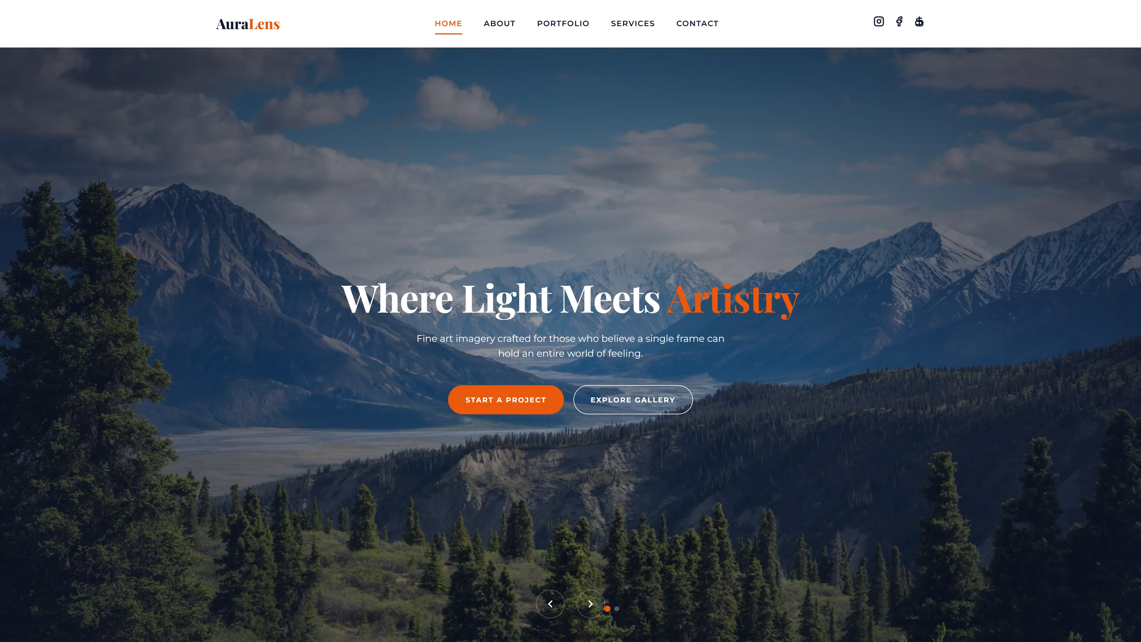
Creative portfolios have one job: make the work look stunning. Everything else is secondary.
- Minimal chrome: No heavy borders, no busy navigation. Your photos should feel like they're floating on the page.
- Category separation: Wedding, portrait, commercial, landscape — separate your work so clients find what they need quickly.
- Loading speed is non-negotiable: Photographers love high-res images, but a slow portfolio loses clients. Use WebP format and lazy loading.
- Contact form with project details: When potential clients inquire, they should specify event type, date, location. This saves you back-and-forth emails.
Unique insight: Add a brief story behind 2-3 key projects. Not just "wedding in Bali" but "This couple wanted a traditional Balinese ceremony with modern photography — here's how we blended both worlds." Storytelling transforms you from "person with a camera" to "artist with vision."
Freelancer & Consultant Websites: Trust Is Everything
When someone hires a freelancer, they're taking a risk. Your website's job is to reduce that perceived risk.
- Specific case studies: Not "I helped a client increase sales" but "I redesigned the checkout flow for an e-commerce store and conversion improved 35% in 6 weeks."
- Real testimonials with names: "John D." is suspicious. "John Davis, CEO of TechCorp" with a photo is credible.
- Clear service packages: Don't make people email you for pricing. Show 2-3 service tiers with what's included.
- Response time promise: "I respond to all inquiries within 4 hours" — this single line increases contact form submissions dramatically.
Unique insight: Add a "My Process" section showing your workflow from inquiry to delivery. Clients aren't just buying a deliverable — they're buying the experience of working with you. Showing a clear process (Discovery → Proposal → Execution → Review → Delivery) makes you look professional and removes anxiety about the unknown.
Small Business & Local Service Websites: The 3-Second Test
For plumbers, tutors, dentists, gyms, and local services, your website has 3 seconds to answer: "Can this person solve my problem?"
- Service area clarity: "Serving the greater Jakarta area" or "Available in Manila and surrounding cities" — visitors need to know you cover their location.
- Service list with prices (or ranges): Even approximate pricing ("Consultations from $50") filters unqualified leads and attracts serious inquiries.
- Trust signals: License numbers, years in business, number of clients served, Google review rating. These aren't bragging — they're evidence.
- One-click call button: On mobile, your phone number should be a clickable link. Most local service searches result in an immediate call.
Unique insight: Add a "Frequently Asked Questions" section specific to your industry. A dentist answering "Does teeth whitening hurt?" or a tutor answering "How many sessions until my child improves?" — this preemively addresses concerns and positions you as the expert. Plus, FAQ content is gold for SEO.
The Common Thread
Notice what's missing from all of this? Talk about "responsive design," "SEO best practices," or "clean code." Those things matter, but they're table stakes — every template on FreeTemplateGo already handles them.
What actually separates a great website from a mediocre one is industry-specific thinking. Understanding what your visitors need to see, in what order, and how to remove friction from their journey. Pick a template, customize it with these insights, and you'll have a website that doesn't just look good — it works.